Development of Barrier Free:More Accessible Font for Normal and Low Vision PeopleYamamoto, Akihiko, Yamamoto, YurikoBarrier-free Design Inc., 2-1-14 Okusawa Setagaya-ku Tokyo, JapanABSTRACT How should the font be designed to permit higher reading performance for normal and low-vision people? We made sample fonts: Barrier Free Light and Medium based on analysis of available Mincho and Sans-Serif-Style. On the process of design, we made the view of low-vision individuals by way of experiment, to shade off the letter face image with the computer using common Adobe Photoshop Software. In this simulation, bold horizontal stems were blurred and become a black mass though Sans-Serif-Style was said to have better readability than Mincho. Light horizontal stems of Mincho vanished. UROKO, the small triangles, and other defective elements caused misconception. Barrier Free could keep the quality higher on the comparison of available fonts, on condition that shading off lost the clearance. Additionally the interview to low-vision individuals also suggests that Barrier Free has better readability than available fonts. Fonts designed to improve reading performance even with low-vision can have also high efficiency of legibility on the computer display. Keywords: ü@ Barrier Free, font, reading performance: legibility: shade off the letter face image. INTRODUCTION Japanese is written utilizing a mixture of Chinese characters, üekanjiüf and Japanese phonetic characters, üehiraganaüf and üekatakanaüf. Some of üekanjiüf have only a few strokes but many of them have complex in structure with a lot of stems. On the contrary to the üekanjiüf which is constructed with vertical, horizontal, curved stems, üehirakanaüf is made of a few free-form curve. Additionally üekatakanaüf, some of the which remarkably alike in appearance of üehiraganaüf in spite of its different role, is originally developed from certain parts of üekanjiüf. Therefore, to develop the set of fonts requires highly skilled designers to harmonize those different types of characters. For their elaboration, many of the people, particularly over age 40, suffer inconvenience from unreadability.*ģ@ Over 60% of the people start to use the reading glasses from age 45ü`55 , *ģA and the population of this category, over age 45 occupy 46.3%.*ģB For reading, two types of fonts, üeSans-Serif-Styleüf and üeMincho-Styleüf are common. *ģC Actually there is not another choice. Notwithstanding the importance of the font which can keep high reading performance, any of the available font can not remark that decides an argument. Designers have designed those fonts with artistic sensitivity in a world by themselves. There was not empirical analysis of their works. Paragraph headings PURPOSE We studied how type fonts should be designed to improve reading performance of people with normal or low-vision. We designed sample fonts that we named üeBarrier-Freeüf Light and Medium, based on analysis of Mincho and Sans-Serif-Style.
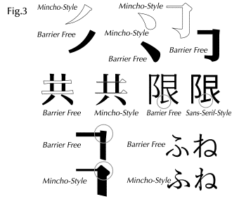
METHOD Analysis of available fonts and improved points of Barrier Free 1. StemsBold stems of Sans-Serif-Style are blurred and become one dark mass. Too thin horizontal stems of available Mincho-Style are vanished and subjects noted that the Sans-Serif-Style has better readability than the Mincho. Stems of natural handwriting give visibility to Barrier Free. Horizontal stems of Barrier Free are designed fairly visible to control the counter between stems and their weight. The important stems and elements in structure are emphasised in order to show an approximation of what the whole image will look like.
2. Elements Mincho-Style has many intricately designed elements. üeUROKOüf, small triangular shaped elements of the letter cause misreading. Pointed tops of Hane, Harai are vanished on its sharp tips. Natural comprehensive vision and elements make readable Barrier Free at a glance. All the elements of Barrier Free are simplified in order not to impair the readability. Additionally the horizontal stems without UROKO have emphatic both ends to show their presence. Pointed top of Hane, Harai are cut as not to vanish its sharp tip. Letters in Barrier Free can maintain their identifiable characteristics with natural comprehensive vision of bodies.
3. Body of the work According that low vision peoples insist Sans-serif-Style has higher readability than Mincho-Style. But the comprehensive vision of letters is disformative structurally in Sans-serif-Style in order to follow a set pattern of squire. And it is uncomfortable to read the book typed with so dark font. It is uncomfortable to use the bold Sans-serif-Style font for novels or newspapers. It also bores eyes out if we read them for long time, however it says that Sans-serif-Style font has more readability. Font to express with rich images of culture. Barrier Free has warm and natural look with a literary flavour maintaining its readability. The each stems are designed slightly asymmetry and delicate shade of difference of each stems gives exquisite look. It is comfortable to use for even classics or informational magazines.
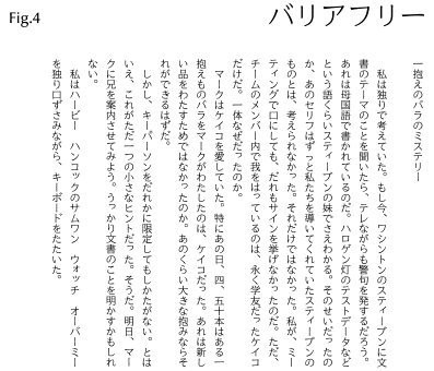
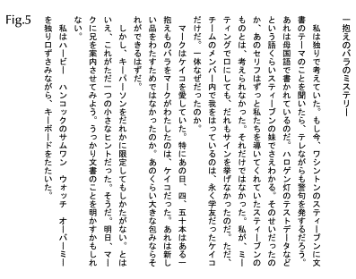
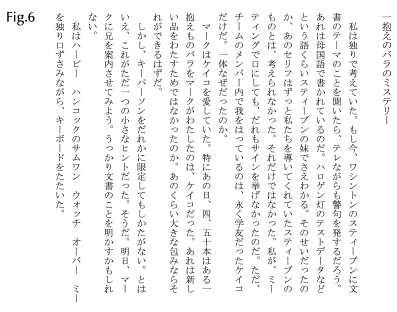
Barrier Free 10 pt, line spacing / 17.6pt
Sans-serif-Style MS Gothic 10 pt, line spacing / 17.6pt
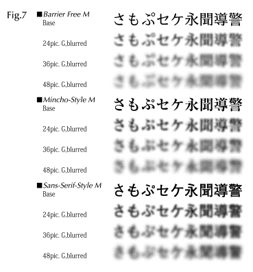
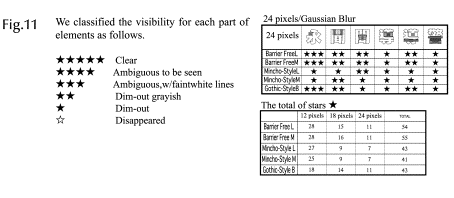
Mincho-Style MS Mincho 10 pt, line spacing / 17.6pt 4. Fomts in the view of low-vision individuals We used a computer running Adobe Photoshop 5.0 software to produce blurred images that supposedly mimic what low-visioned persons would perceive when viewing clear images. *ģE Barrier Free is the font which designed as to keep the clearance even in the condition of being blurred on the folloing points.
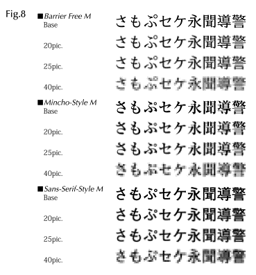
5. Legibility Font: the new possibility of Barrier Free Barrier Free could keep the quality higher on the comparison of available fonts, on condition that shading off lost the clearance. This simulation, to produce blurred images is more specifically to make grainy one. Comparison of Image in lower resolution verification in low vision is the strictest inspection of quality. This approach to low vision gave the new possibilities of Barrier Free as legibility fonts with the low screen resolution of the computer. The weak stems of Mincho-Style and small counter of Sans-serif-Style disappear when the resolution becomes lower. And the counter, white space between Stems of Sans-serif-Style is lost, too. During the process of design, we used a computer to produce blurred images, that resolution of the image lower. Letters in Barrier Free are designed in order to maintain legibility with the low screen resolution. The letters which can keep their readability even being shade off, can also keep their legibility on the deteriorated condition by printing, in the sight of moving state so on.
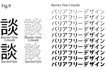
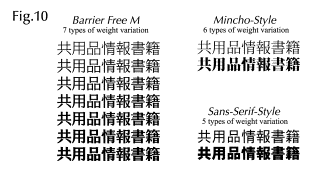
6. Barrier Free Sign Lineale type of Barrier Free can also keep the readability from a distance. The first step of the study was done for the reading type. The font for the sign is required the other performance based on the concept of regular one. The trial sample of Lineale type of Barrier Free is designed for the high reading performance and additionally avail more variations of the weight.
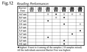
ü@ 7. Interview to the low vision individuals We interviewed to 9 partially sighted visual impaired people showing the samples.
RESULTS We verified by way of experiment, to shade off the letter face image on the computer display. Sans-serif-Style was said to have better readability than Mincho-Style. But in the simulation, bold horizontal stems were blurred and become a black mass. Light horizontal stems of Mincho vanished. UROKO, the small triangles, and other defective elements caused misconception. Barrier Free could keep the quality higher on the comparison of available fonts.
Additionally the interview to low-vision individuals also suggests that Barrier Free has better readability than available fonts.
Conclusionü@ From this finding, we concluded Barrier Free could keep the quality higher on the comparison of available fonts, on condition that shading off lost the clearance. Additionally, interviews with low-vision individuals suggested that Barrier Free is more readable than available fonts. Externalisation of readability Barrier Free could keep the quality higher on the comparison of available fonts, on condition that shading off lost the clearance and it also can be said it can keep legibility with the low screen resolution of the computer. This verification suggests not only the readability of low-vision but also that of normal-vision at a glance or comfort of long time reading. This study is significant that the merit for the reading performance for low vision people can be shared with the ordinary people and advanced technology. Acknowledgements The first author had unexpectedly ceased just after finishing this work. Please allow us to show you his last work, which was saved on his machine just 1 hour before his sudden death.
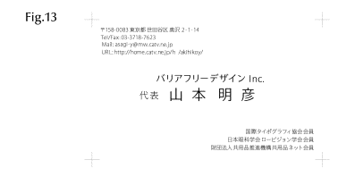
This is the application of Barrier Free: name card. The main letter, the name and address are typed in Barrier Free Lineale. We made the concept logically, but the most important performance is designed as beautiful letters. As we mentioned developing the set of Japanese fonts requires highly skilled designers, he was one of very few those. That's what it is the lifework of Yamamoto, Akihiko. References *ģ@ E&C Project, 1998, ügAsa okitekara Yorunerumadeno Hubensachousa: Shikakushougaisha Anketochousa (Youyakuhen), Tokyo, Japan, Shakaifukusihoujin Nihon Tenji Toshokan *ģA Shouhin Kagaku Kenkyujo, 1990. ügKoureisya no Shintaitekikiinou no Henka ni Taiousuru Shouhin no Chyousakenkyuüh, Tokyo, Japan, Zaidanhoujin Chiikishakaikenkyujo, Shiseikenkyuujo *ģB Statistics Bureau & Statistics Center, Ministry of Public management, home Affairs and Telecomunications, 2001. ügPopulation Census, Current Population Estimatesüh, Japan, http://www.stat.go.jp/english/data/index.htm *ģC Katsui, Mitsuo, Tanaka, Ikko. 1993. ügGendai Dezain Jiten, 1993üh, Tokyo, Japan: Heibon-sya, Type Face Mincho-tai, Gossiku-tai page150, 151, 152, 153. *ģD Adobe Systems Incorporated, Adobe Photoshop5.0 Software, 1998, Adobe Systems Incorporated, Tokyo, Japan, USA, http://www.adobe.co.jp/products/photoshop/main.html?awe_1721 |
||


